Click Here for the full article.
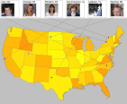
Using world and custom U.S. maps, Perl, GD, and the Cooperative Association for Internet Data Analysis (CAIDA) plot-latlong tool, this article demonstrates how to create your own effective data visualizations in the spirit of Google maps and the U.S. national atlas.
Original
link at IBM developerworks. Please use the cached copy if the link is dead.